

TT BLOG

Rob Dand
The club’s recent 2023-24 home kit reveal was about as well-received as a scorpion in a Kinder egg, with fans almost unanimously deciding they hated it within minutes of seeing the photos. What this actually means in practice for club shop shirt sales remains to be seen, but as much as I like to resist bandwagon-jumping, this one’s ambling past at a very slow speed and it’s going in my direction, so I’m going to hop on board.
I have to say, I’m with the majority on this one. It’s a crumbling eyesore of a shirt that needs hauling down. A multiversal anomaly that should not exist on this timeline. I can’t help but feel that a more stripped-back version would have gone down well though, and to my eyes there are two really simple things that would save it. First of all, those fang-like white stripes are more of a half-baked and confusing visual distraction than anything, and either continuing their vertical reach or (preferably) removing them completely, would probably improve it.
Secondly, as ready as I am for a shift away from the 1899 branding, the South Devon College logo is about as suitable for the front of a football shirt as a massive list of my favourite motorway service stations. The miniscule font, the strange empty square, the addition of two new colours – the black, and especially the purple – all combine to make what I think is one of the strangest uses of space since Lidl decided what to put in their central aisles. If we still had 1899 on the front of that shirt, in blue, it would work. Thankfully, the new away shirt does tie together a little better, but I’m really hoping for a beautiful third kit that the club is holding back for a marquee signing to model in the coming weeks…
The now-annual new kit launch always generates debate, and prompts a little bit of misty-eyed nostalgia for shirts of yesteryear. Let me tell you that, given my usual wardrobe choices, supporting a team whose irrepressible colour palette nearly always draws from the iconic sand and surf landscapes of the South Devon coastline has been a bit of a struggle. As a fan of The Cure who likes old horror films and decorates his flat with small, ornamental skulls (I promise I’m not a serial killer), I felt it in my bones when Lego Batman proclaimed in his eponymous 2017 documentary: “I only work in black… Or sometimes very, very dark grey”.
When TT Editor Dom asked me to write this piece, chatting through my Top Five TUFC Shirts (also allowing me to tap into my love of the book ‘High Fidelity’), he must therefore have known that this would not be the most colourful blog post he had ever commissioned. Following on from the frankly gripping recent fan poll on the TT Facebook, and hot on the heels of the club’s latest ‘stunning’ kit launch, here are my slightly ‘alternative’ picks for the best TUFC shirts of all time.
5) 1995-97 AWAY
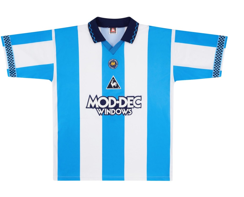
We’ve ended up with a couple of nice blue shirts over the years, and certainly the newly-unveiled away shirt seems to have been a reasonable hit with the fanbase. Indeed, a similar looking shirt to the one I’ve picked out below, our change strip from 1995-1997 was also included in the TT fan poll. I’ve picked out this one in preference though, primarily due to the more subtle shade of blue.
4) 1991-93 HOME
Okay, I couldn’t put a list together of Torquay United shirts without including a yellow one. However, 4th was as high as it was ever going to go… Ignoring the ‘1899’ era, which – spoiler alert – I’ll come to shortly, this one’s probably my favourite classic home shirt, and did end up at the top of the TT poll as well, so clearly there’s a bit of love out there for it.
I missed out on seeing it in the flesh, as my first game was the season after this one was retired (side note: remember when shirts lasted more than one year?!), but it’s been repeated a couple of times since and is one of the quintessential TUFC looks. I much prefer the vertical stripes to horizontal ones, and from a purely selfish yellow-hating point of view the more surface area that white can take up the better, plus the navy trim is more my style than the primary colour nightmare we seem to get more often than not these days.
3) 2010-11 AWAY
In 2010, the club threw a curveball and answered the prayers of emo kids everywhere, by releasing this lovely little black number that matched the colour of our tortured souls. After what felt like a good few years of fairly standard yellow, white and blue, the black kit was a bit of a departure, and although we’ve had a monochrome striped effort since, remains the only matchday shirt perfect for when you’ve got the football at 3 and a My Chemical Romance gig at 8.
2) 2020-21 AWAY

I’m a fairly simple man who can eat meat and drink beer with the best of them, but I’m also very comfortable with having a feminine side (whatever that means in 2023). What I’m trying to tell you, Dear Reader, is that I don’t mind a bit of pink, and nor should you. Promotion should have been the legacy of the 2020-21 season, but the consolation prize was three excellent kits. This one was my favourite.
1) 2019-20 BLACK AND GOLD

I wasn’t sure about including this one in my list at all, let alone putting it right at the top of the pile. Released only as a limited edition anniversary special, for those of us with the blackest of hearts, this was an absolute thing of beauty. Modelled by club legend Olaf Koszela, it sparked a fair bit of praise from all corners of the football world and heralded the start of the ‘1899’ era, which brought with it some seriously nice shirts. Unfortunately, I was not quick enough off the mark to pick one up. My birthday’s in May and I can probably squeeze into a medium if you give me a few weeks to prepare, thanks for asking.
COYY – ROB

Rachel Malloch
@Rachelvillavox
Alongside the release of the new 23/24 home and away shirts yesterday there has been a feverish wave of conjecture, the release has met with a back up of intense emotions that range from ambivalent to downright apoplectic.
Who would have thought that a yellow blue and white material (emphasis on the white for it is the white stripes that have caused the most upset) would trigger opinion polls and debate on social media and a level of irritability and outrage that were seemingly absent, certainly muted when our relegation fate was sealed and the club announced that Gary Johnson’s 5 year tenure was set to continue “whether you like it or not” quoteth he who will be obeyed, certainly for season 23/24, his 6th season in charge.
Less uproar has greeted the blue and white away strip that lends itself ever so slightly to the Argentina national shirt and one that has all but gone viral in its appreciation society, so at least the club and Puma can breathe a sigh of some relief there.
So with all the hue, blue and yellow cry, let us delve back into the Torquay United shirt vaults and look at some right bobby dazzlers, shirts that most opinion polls would view favourably.
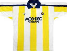
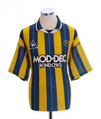
1) 1993-95 HOME
Season 1993/94 horizontal stripes with a collar, the iconic Mod-Dec Windows sponsors which musters memories of Adrian Foster, Darren Moore, Kevin Hodges and the like. This was the season I first attended Plainmoor so it holds sentiment to me.
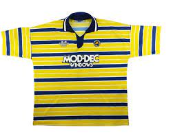
2) 1995-97 HOME
Season 1995/96 again, the same colour scheme this time with vertical stripes but resplendent again with a collar, images of players like Rodney Jack, Charlie Oatway, Paul Buckle and Alex Watson.
3) 2020-21 – YELLOW, WHITE AND NAVY SHIRTS
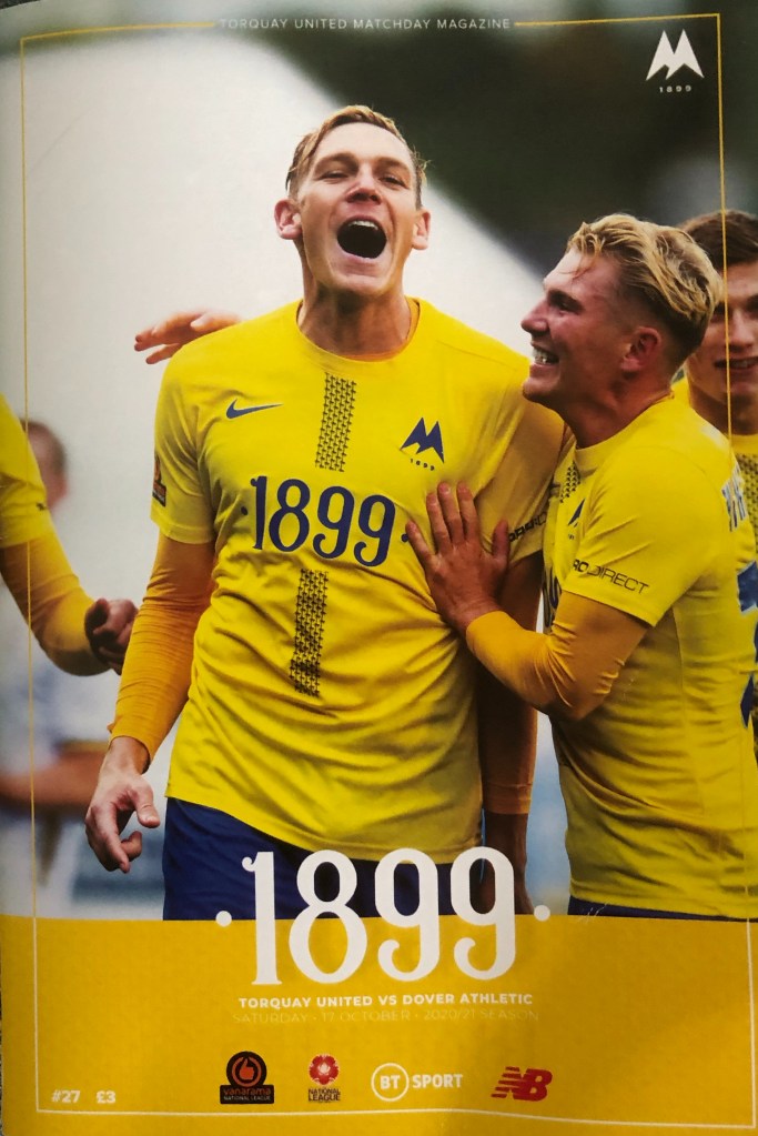
Season 2020/21 yellow, white and navy complete with tyre tracks that were in fact tiny palm trees (or New Zealand cabbage plants for the pedantic) and a whole conglomerate of players who graced this shirt of Bens Wynter and Whitfield, Joe Lewis, Kyle Cameron, The Lemon, Armani…….that sodding season when not only were our shirts gorgeous but our squad was too and the season we really, really, really should have been promoted automatically. Big budget, big players…….big bloody let down.
4) 2019-20 BLACK AND GOLD
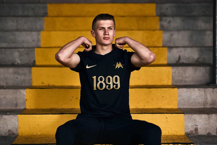
2019/20 Torquay United 120th Anniversary shirt, the black one with the gold 1899 and club crest and released after we had found our way back in the big time of National League, a shirt of real beauty although the season itself was curtailed by COVID, the shirt was lauded and bought up far and wide, and XXL sizes too!
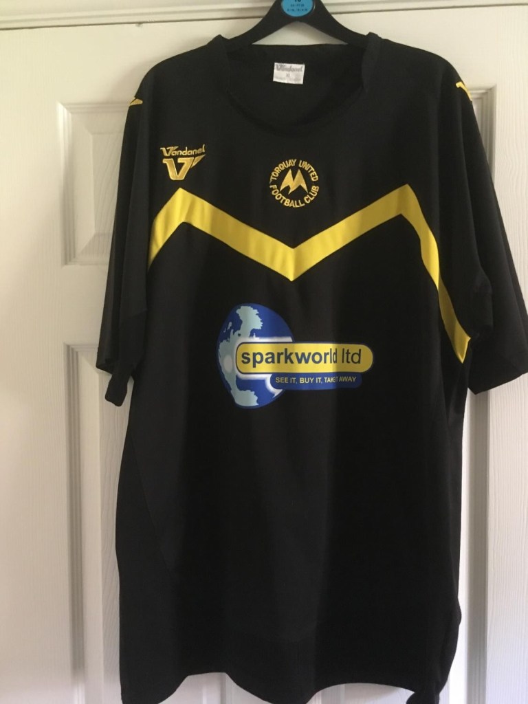
5) 2008-09 HOME

Season 2008/09 our play offs promotion season and whilst the equally lovely white away shirt was worn by the likes of Carlisle, Benyon, Sills, Hargreaves, Nicholson, Mansell et al, the yellow City Link Builders Vandanel home shirt saw us through a remarkable, memorable season.
COYY – RACHEL
OTHER ARTICLES
TT PARTNERS


TWITTER – INSTAGRAM – ETSY – YOUTUBE – FACEBOOK


Home kit MUST be predominately YELLOW with a touch of blue and not with two hideous white pointy things on it !! At least the away shirt is o.k. I for one am still fuming that the two failures that took us back to regional football are still here . No forgiveness unless we win this league this season.
LikeLike